Posted on Leave a comment

The Art of British Railway Posters: How They Defined Travel Nostalgia

Introduction to British Railway Posters

When one thinks of the golden age of travel, it’s difficult not to picture the vibrant and captivating railway posters that adorned station walls and travel agencies throughout the early to mid-20th century. These pieces of art were more than just advertisements; they encapsulated a spirit of adventure, evoked a sense of nostalgia, and played a crucial role in defining how the British public perceived travel. The combination of art, culture, and a dash of marketing wizardry created a phenomenon that continues to influence our understanding of travel today.

The Origins of Railway Posters

The journey of railway posters began in the late 19th century, a time when the burgeoning railway network in Britain was transforming how people traveled. Railways were no longer just a means of transportation; they became a symbol of progress and modernity. The Industrial Revolution had given rise to a new era of mobility, and with that came the need for effective advertising to encourage the public to embrace this novel way of traveling.

Initially, railway companies relied on more straightforward methods of marketing, such as pamphlets and simple handbills. However, as competition intensified, they soon realized the importance of visually striking posters that could capture attention and inspire wanderlust. Artists were commissioned to create eye-catching designs that not only showcased the railway services but also highlighted the stunning landscapes and exciting destinations.

The Artistic Evolution

The artistic styles of railway posters evolved over the decades, reflecting broader trends in visual culture. Early posters were often influenced by Art Nouveau, characterized by elaborate decorative elements and flowing lines. These designs were whimsical and romantic, enticing travelers with promises of beautiful landscapes and leisurely journeys.

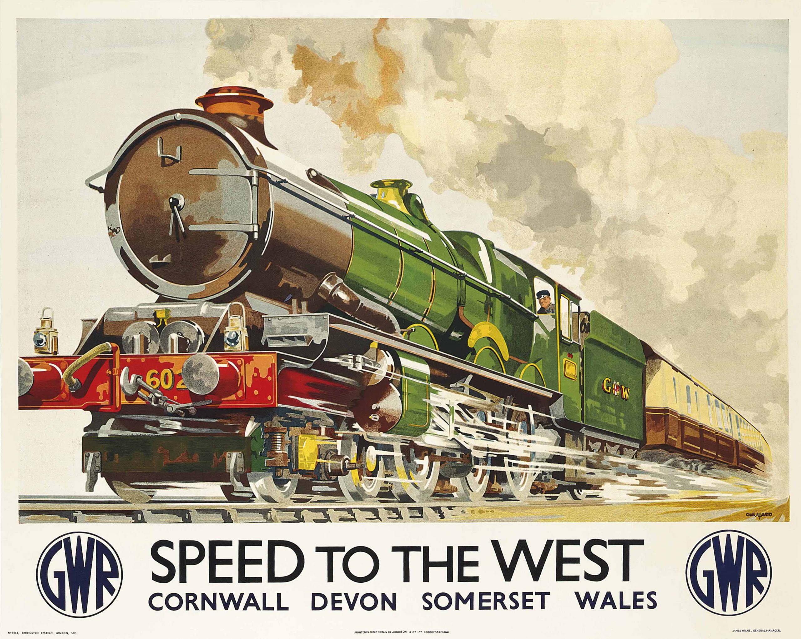
As the 1920s approached, a shift occurred towards a more streamlined and modern approach, mirroring the influence of the Art Deco movement. Bold colors and geometric shapes replaced the intricate designs of previous eras. The posters became less about the landscapes themselves and more about the experience of travel, emphasizing speed, efficiency, and luxury. The imagery often depicted smiling families enjoying their journeys or glamorous couples sipping tea in lavish train carriages.

Iconic Designers and Their Contributions

Several artists played significant roles in shaping the aesthetic of railway posters, each bringing unique flair and vision to the medium. Among them was Frank H. Mason, whose work is characterized by vivid colors and dynamic compositions. His posters often highlighted coastal resorts, inviting travelers to escape to the sea. Another notable figure was Edward McKnight Kauffer, who introduced a modernist style with bold graphics and a focus on transportation.

One cannot discuss railway posters without mentioning the impact of the London Transport Museum, which has preserved a vast collection of these works. The museum has played a pivotal role in showcasing the history and significance of travel posters, ensuring that future generations appreciate their artistic value.

The Role of Typography

Typography was another essential element in the design of railway posters. The fonts used were often custom-designed to reflect the character of the rail service. Bold, sans-serif typefaces became popular, as they were easily readable from a distance, making them effective for passing travelers. Each railway company developed its own unique typographic identity, which helped to differentiate their services while contributing to the overall visual appeal of their posters.

Themes and Imagery

The themes represented in railway posters were as diverse as the destinations they promoted. Coastal resorts, picturesque countryside, and historic cities were all common subjects. The imagery often conveyed a sense of adventure, with bold depictions of landscapes, iconic landmarks, and cultural attractions. These visual narratives not only highlighted the beauty of the British Isles but also evoked emotions tied to travel—excitement, curiosity, and a longing for exploration.

Seaside holidays became a recurring theme, especially during the post-war period when a growing middle class sought affordable vacations. Posters featuring idyllic beach scenes, vibrant promenades, and cheerful families were designed to entice the public to visit popular coastal towns such as Brighton, Blackpool, and Margate. This imagery tapped into a collective desire for leisure and escape, perfectly capturing the ethos of a bygone era.

The Impact of World War II

The onset of World War II brought significant changes to the railway industry and its advertising practices. With travel restrictions and rationing in place, the focus shifted from leisure travel to wartime transport. However, even during these challenging times, railway posters adapted to convey messages of resilience and unity. Designs encouraged the public to support the war effort by utilizing rail services for essential travel.

Following the war, the return to peacetime brought about a revival of travel posters, reflecting a renewed sense of optimism and adventure. The design aesthetic began to evolve once again, incorporating elements of modernism and a more vibrant color palette. Artists embraced a sense of freedom and exploration, depicting not only domestic travel but also international destinations.

The Decline of the Poster Era

As the decades progressed, the rise of television, the internet, and other forms of advertising began to overshadow railway posters. The art of poster design experienced a decline as companies shifted their marketing strategies to embrace new technologies. However, this decline does not diminish the significance of railway posters in shaping travel culture.

Despite the changing landscape, railway posters have experienced a resurgence in popularity in recent years. Vintage designs have become sought-after collectibles, with many people appreciating their historical and artistic value. Reproductions of iconic posters can be found in homes, offices, and cafes, serving as a reminder of the allure of travel and the artistry that defined an era.

Nostalgia and Modern Travel

Today, the charm of railway posters lies in their ability to evoke nostalgia. They transport us back to a time when travel was an adventure, characterized by elegance and romance. In an age of fast-paced travel and digital distractions, the artistry of these posters reminds us to slow down, appreciate our surroundings, and embrace the journey.

Many modern travel companies and tourism boards have recognized the nostalgic power of railway posters and have begun to incorporate retro-inspired designs into their marketing efforts. By blending contemporary elements with vintage aesthetics, they seek to rekindle that sense of adventure and connection to the past.

Conclusion: Preserving the Legacy

The art of British railway posters is a remarkable blend of creativity, marketing, and cultural significance. These vibrant pieces of art not only defined an era of travel but also continue to inspire us today. As we look back on their legacy, we are reminded of the joy of exploration and the beauty of the world around us. The influence of these posters will undoubtedly endure, inviting future generations to embark on their own journeys filled with wonder and nostalgia. Whether you’re a travel enthusiast, an art lover, or simply someone who appreciates a good story, the world of railway posters is one that continues to captivate and inspire.

Posted on Leave a comment

The Real Outfits Behind Different Scottish Tartans (And Which Ones You Can Actually Wear)

red blue and black striped textile

A Journey Through the Colors of Scotland: Discovering Tartan Patterns and Their Meaning

Tartan—what a delightful word! It rolls off the tongue and conjures up images of rolling hills, bagpipes, and perhaps a wee dram of Scotch. But tartan is more than just plaid fabric; it carries a rich history and significance that traces back centuries. In this article, we’ll delve into the fascinating world of tartans, exploring the real outfits associated with different patterns and which ones you can actually wear. So grab your kilt (or a cozy chair), and let’s embark on a colorful journey through Scottish culture!

The History of Tartan: More Than Just a Fashion Statement

Before we dive into the specific tartans and their outfits, let’s take a quick trip down memory lane. Tartan was originally designed as a way to identify different Scottish clans. Each pattern, with its unique color combinations and designs, served as a badge of honor, allowing clansmen to recognize each other from a distance—kind of like a bespoke family crest made of fabric!

The term “tartan” itself is derived from the French word “tartarin,” which referred to the woven fabric. Historically, these patterns were woven from wool, dyed using natural substances like plants and minerals. The vibrant colors and intricate designs you see today are the result of centuries of tradition.

The Science of Tartans: Understanding Patterns and Colors

Tartans are composed of a series of horizontal and vertical stripes, which intersect to create blocks of color that form a unique pattern. Each color can have specific meanings associated with it. For example, green often symbolizes nature, while blue can represent loyalty. The combinations and arrangements of colors tell a story about the wearer, their clan, or the region they represent.

The Scottish Register of Tartans, established in 2008, is a treasure trove for tartan enthusiasts. It contains thousands of registered tartans, each with its own history and significance. From military tartans to those commemorating historical events, there’s a pattern for every occasion.

The Most Iconic Tartans and Their Outfits

Now that we have some background, let’s explore some of the most iconic tartans and the outfits traditionally associated with them. We’ll also discuss which of these can actually be worn today!

1. Royal Stewart Tartan

One of the most recognizable and widely used tartans is the Royal Stewart. With its rich red background, interspersed with green and yellow stripes, this tartan is linked to the Royal Family of Scotland. It’s often associated with celebrations, making it a popular choice for festive occasions.

Outfit Ideas: The Royal Stewart tartan is frequently seen in kilts, skirts, and even bow ties. For a classic look, consider pairing a Royal Stewart kilt with a white dress shirt, a black jacket, and a sporran. Women can incorporate the tartan into a beautiful wrap dress or a stylish shawl, perfect for a ceilidh or any Scottish-themed event.

2. Black Watch Tartan

The Black Watch tartan, alternatively known as the Government tartan, boasts a more subdued palette of dark green and blue. This pattern has military roots, originally worn by the 42nd Highland Regiment, also known as the Black Watch.

Outfit Ideas: The Black Watch is versatile and suitable for both formal and casual occasions. A classic Black Watch kilt paired with a tailored blazer and a crisp white shirt makes for an elegant outfit. For a more casual look, opt for a Black Watch button-down shirt paired with dark jeans.

3. MacLeod Tartan

The MacLeod tartan is characterized by its bold yellow and black stripes, representing the MacLeod clan. This lively pattern symbolizes resilience and loyalty.

Outfit Ideas: The MacLeod tartan is perfect for those who want to make a statement. A MacLeod kilt, paired with a vibrant yellow shirt, can create a fun and festive outfit for Scottish festivals. Women might choose a MacLeod tartan dress or a playful skirt to add a splash of color to their wardrobe.

4. Campbell Tartan

The Campbell tartan features a combination of green and blue in a distinctive checkered pattern, reflecting the clan’s historical ties to the Scottish Highlands. The Campbells are known for their rich history and contributions to Scotland’s political landscape.

Outfit Ideas: A Campbell tartan kilt is a fantastic choice for formal events. Pair it with a dark blue jacket and a crisp white shirt for a polished appearance. For a more relaxed look, consider a Campbell tartan scarf or tie to add a touch of Scottish flair to your outfit.

Tartan for All: Which Patterns Can You Wear?

You may be wondering if you can wear any tartan or if certain patterns are reserved for specific clans. The good news is that, in modern times, tartan has become more inclusive. While it’s respectful to honor the tradition of clan tartans, many people choose to wear any tartan that resonates with them personally.

Universal Tartans

Several tartans have been designated as “universal” or “public” tartans. These are not tied to any particular clan and can be worn by anyone. Some examples include:

  • Modern Tartans: Many designers have created contemporary tartan patterns that offer a fresh take on traditional styles. These can be worn freely and are perfect for those looking to express their individuality.

  • National and Festival Tartans: Tartan patterns designed to represent Scotland as a whole, or specific festivals like the Highland Games, are also available for public use.

Tartan in Modern Fashion

In contemporary fashion, tartan has made a significant comeback. Designers are incorporating tartan into their collections, using it in everything from suits to dresses, and even accessories. The key is to strike a balance between traditional and modern styles to create a look that feels authentic yet fresh.

Tips for Wearing Tartan Today

  • Mix and Match: Don’t be afraid to mix tartan with other patterns. A plaid scarf can be paired with striped or floral outfits for an eclectic look.

  • Accessorize Wisely: If you’re unsure about donning a full tartan outfit, start small! A tartan tie, scarf, or handbag can add a touch of Scottish heritage without overwhelming your look.

  • Keep it Subtle: For a more sophisticated take on tartan, opt for muted colors or smaller patterns. This allows you to incorporate the fabric into your wardrobe while maintaining a modern aesthetic.

Conclusion: Embrace the Tartan Spirit

Tartan is more than just a fabric; it embodies a sense of heritage, identity, and celebration. Whether you’re proudly wearing the colors of your clan or simply sporting a playful pattern that speaks to you, tartan offers a rich tapestry of history and culture. So, the next time you pull on a kilt or toss on a tartan scarf, remember that you’re not just wearing a piece of clothing—you’re wrapping yourself in a story that spans generations. Embrace the spirit of tartan, and let it inspire your wardrobe and your adventures!

Posted on Leave a comment

London Tube Map Evolution: How It Became a Design Icon

A Journey Through the Tube: The Evolution of an Iconic Design

When you think of London, a few things might spring to mind: the iconic Big Ben, the picturesque Thames River, and, of course, the London Underground. But have you ever paused to admire the artistry of the Tube map? This seemingly simple diagram has become a global design icon, one that transcends its original purpose and offers a fascinating glimpse into the evolution of urban design and public transport. Buckle up as we take you on a journey through the history and development of one of London’s most recognized symbols!

The Birth of the Underground

The London Underground first opened to the public in 1863, making it the world’s first underground railway system. However, the initial experience was far from user-friendly. The early maps were complicated and hard to navigate, making it difficult for riders to know where they were going. Imagine trying to decipher a sprawling, chaotic maze of lines and stations without any clear guidance. It was clear that something had to change.

The Map That Changed Everything

Fast forward to 1931, when Harry Beck, an engineering draftsman, created a revolutionary new map. Beck’s design was unlike anything that had come before it. Instead of adhering to the physical geography of London, he opted for an abstract, simplified layout. The Tube map was transformed into a network of straight lines and clear connections, with stations represented as uniformly spaced dots. This radical departure from realism allowed passengers to easily see the relationships between different lines and stations, making navigation a breeze.

The Impact of Beck’s Design

Harry Beck’s Tube map was a game-changer. It made the Underground accessible to the broader public, opening up London in ways that had never been imagined. Suddenly, navigating the sprawling city felt less daunting, and passengers could confidently hop on and off trains. The map not only facilitated travel but also ignited a love for urban exploration. People began to see London as an interconnected web of neighborhoods, each with its unique charm and attractions.

The Art of Color Coding

One of Beck’s genius innovations was the use of color coding for different lines. Each line was assigned a distinct hue, making it easy for travelers to quickly identify their route. This vibrant palette became synonymous with the Underground, allowing the map to be recognizable at a glance. Over the years, the colors have been refined, but the core concept remains the same. The visual impact of the colored lines made the map not just functional, but also aesthetically pleasing.

Keeping Up with Change

As London grew and the Underground expanded, adjustments to Beck’s design were necessary. New stations were added, lines were extended, and the network underwent significant changes. The map evolved alongside the city, adapting to the needs of its users. Each update was meticulously considered, balancing the need for clarity with the complexity of an ever-expanding network.

Design Philosophy: Simplicity Over Reality

What Beck introduced was more than just a map; it was a philosophy of design. The principle of simplicity over reality became foundational for many graphic designers. His approach demonstrated that clarity and ease of use should take precedence over accuracy. This idea is now embedded in many public transport systems worldwide, evidenced by the clean, minimalist designs that we see today.

Iconic Updates and Variations

Over the decades, the Tube map has undergone several notable updates. Designers have added elements, such as the iconic “tube” logo and the recognizable roundel symbol. They also experimented with new formats and designs, such as the “Bakerloo” and “Central” lines, which introduced fun typography and graphic elements. With each update, the design team aimed to preserve the essence of Beck’s original vision while ensuring the map remained useful and contemporary.

The Tube Map in Popular Culture

The Tube map’s influence extends far beyond the underground stations of London. It has infiltrated popular culture and has been referenced and parodied in various forms of media. From art installations to fashion, the distinctive style of the map has inspired countless creative projects. Artists like Eduardo Paolozzi and Ben Eine have reinterpreted the map in their work, showcasing its versatility as a design element.

The Tube Map Goes Digital

As technology advanced, so did the way we interact with the Tube map. The introduction of mobile apps revolutionized how commuters accessed the map. No longer constrained by a physical piece of paper, riders could now receive real-time updates and live journey planning at their fingertips. This digital transformation maintained the essence of Beck’s design while embracing the future of transportation.

Sustainability and Accessibility

In recent years, the focus on sustainability and accessibility has also influenced the design of the Tube map. The introduction of features like step-free access and the promotion of bike routes illustrate a shift toward an integrated transport system that accommodates all users. The map continues to evolve, reflecting changing societal values and the need for inclusivity in urban design.

The Tube Map: A Design Icon

Today, the Tube map is considered a masterpiece of graphic design, celebrated for its innovation and impact on urban navigation. It has been featured in exhibitions, received numerous awards, and is studied in design schools around the world. Beck’s original vision, which emphasized clarity and simplicity, has become a template for transport maps globally.

Conclusion: More than Just a Map

So, the next time you find yourself navigating the London Underground, take a moment to appreciate the artistry behind the Tube map. What was once a chaotic representation of a complex transport system has transformed into a design icon that is both functional and beautiful. Harry Beck’s genius lies not only in his groundbreaking design but also in his foresight to recognize that a map could be so much more than a tool for navigation. It could be a visual representation of a city’s spirit, an invitation to explore, and a source of pride for Londoners and visitors alike.

In the ever-evolving landscape of urban life, the Tube map stands as a testament to the power of thoughtful design. It has become an enduring symbol of London and continues to inspire generations of designers and city planners worldwide. Next time you glance at that familiar map, remember: you’re looking at history, innovation, and a piece of art that has shaped the way we think about urban transit. So grab your Oyster card, hop on the Tube, and get ready to explore the vibrant tapestry of London that lies just beyond the next station!

Posted on Leave a comment

How the London Tube Map Distorts Geography (And Why It Works Anyway)

Introduction to the Tube Map Phenomenon

The London Underground, affectionately known as the Tube, is not just a mode of transportation; it’s a symbol of the city itself. From tourists snapping selfies at iconic stations to locals weaving through the maze of lines during rush hour, the Tube is integral to the rhythm of London life. But if you take a closer look at the Tube map, you might notice something peculiar: it doesn’t reflect the actual geography of London. Instead, it’s a carefully crafted representation that has become a design marvel in its own right. Let’s dive into how this map distorts geography and why this approach has ultimately been a resounding success.

A Brief History of the Tube Map

The inception of the Tube map dates back to the early 20th century. In 1931, Harry Beck, an engineering draftsman, designed the map that we recognize today. He sought a way to simplify the complex web of underground lines, opting for a non-geographical representation. By using a grid layout and straight lines, Beck created a map that was easy to read, even for those unfamiliar with the city. This revolutionary approach transformed the way commuters navigated the Tube, shifting the focus from geography to accessibility.

The Map’s Distortions Explained

While Beck’s map is undoubtedly iconic, it intentionally distorts distances and angles. For instance, the stations might appear closer together than they are in reality, and the geography of the city is sacrificed for clarity. Here are some notable examples of how this distortion plays out:

Distance Between Stations

One of the most glaring examples of distortion is the distance between stations. For instance, the bustling areas of Camden and Leicester Square are depicted as being a short hop away from each other, but in reality, they are a considerable distance apart. This is a common occurrence throughout the map, where some stations are clustered together while others are spaced out, all for the sake of clarity.

Misrepresentation of Geography

London is a sprawling city with a diverse geography, including parks, rivers, and varied neighborhoods. The Tube map flattens this complexity into a simple, abstract representation. The River Thames, which runs through the heart of London, is represented as a straight line, and the beautiful parks like Hyde Park and Regent’s Park are merely dots on the map. This abstraction strips away the richness of London’s landscape but aids in the map’s usability.

Why It Works: The Power of Abstraction

Despite its geographical inaccuracies, the Tube map works brilliantly for several reasons:

Simplification for Navigation

The primary purpose of the Tube map is to help passengers navigate the Underground system quickly and efficiently. By using straight lines and a consistent design, passengers can easily determine how to get from Point A to Point B without being bogged down by the complexities of the city’s actual layout. This level of simplification allows for quick decision-making, which is essential during the bustling rush hours.

Increased Inclusivity

The Tube map is designed to be accessible to everyone, including tourists who may not be familiar with London’s geography. This abstraction makes the map universally understandable, regardless of a passenger’s prior knowledge of the city. People from different backgrounds can use the map with confidence, making it an inclusive tool for navigation.

The Influence on Other Cities

The success of the Tube map has influenced the design of transit maps worldwide. Cities like Paris, New York, and Tokyo have adopted similar strategies, opting for simplified, non-geographical maps that prioritize clarity over accuracy. This global trend reflects an understanding that usability is often more critical than geographic precision when it comes to public transportation.

Iconic Branding and Cultural Impact

The Tube map has transcended its original purpose as a navigation tool to become a cultural icon. It has inspired art, fashion, and even music. Its distinct design and vibrant colors make it instantly recognizable, and it’s often used in various forms of media to symbolize London.

Art and Design

Artists have reimagined the Tube map in countless ways, from minimalist designs to elaborate reinterpretations that highlight various aspects of London’s culture and history. These artistic ventures demonstrate the map’s versatility and its ability to resonate with people on multiple levels.

Fashion Statements

The map has also made its way into fashion. Clothing brands have incorporated the Tube map into their designs, creating trendy apparel that celebrates London’s iconic transport system. From T-shirts to tote bags, the Tube map serves as a fashionable reminder of the city’s rich urban tapestry.

The Future of the Tube Map

As technology continues to evolve, so too does the way we navigate our environments. Mobile apps and GPS systems have changed the way people interact with maps, providing real-time updates and geographical accuracy. However, the Tube map remains relevant, proving that traditional designs can coexist with modern technologies.

Digital Adaptations

The London Underground has embraced technology by developing digital versions of the Tube map. These digital maps often feature additional information, such as live service updates and accessibility options. This integration of technology allows commuters to benefit from both the clarity of the traditional map and the advantages of modern navigation tools.

Conclusion: A Love Letter to the Tube Map

In the end, the London Tube map is a testament to the power of design. Its distortions may misrepresent the geography of London, but they serve a greater purpose: to simplify navigation and make the city accessible to everyone. It’s a brilliant example of how function and form can come together to create something extraordinary.

Whether you’re a daily commuter or a tourist exploring the vibrant streets of London, the Tube map remains an essential companion, guiding you through the city’s underground labyrinth with ease. So, the next time you find yourself riding the Tube, take a moment to appreciate the artistry and ingenuity behind the map. After all, it’s not just about where you are; it’s about where you’re going—and this map is here to help you get there.

Posted on Leave a comment

The History of the Mug: From Drinking Vessel to Insult

white ceramic mug on white surface

Introduction

The term “mug” has a fascinating journey through history. What began as a simple drinking vessel has morphed into a term used in various contexts, including an amusing and somewhat cheeky insult. This article will take you on a delightful ride through time, exploring the evolution of the word “mug” from its origins to its contemporary usage in both the physical and metaphorical senses.

Origins of the Mug

The word “mug” can be traced back to the 15th century, derived from the Middle English term “mugge” or “mugg,” which referred to a large cup used for drinking. The earliest mugs were typically made from wood, clay, or metal, often featuring a handle for convenience. They served a practical purpose: to hold beverages ranging from water and ale to coffee and tea.

As time marched on, mugs began to evolve in design and materials. By the 16th century, potters were producing earthenware mugs adorned with intricate designs. The invention of porcelain in China and its later introduction to Europe in the 18th century led to a significant transformation. Porcelain mugs became symbols of status and sophistication, often decorated with elaborate artwork that reflected the owner’s taste and wealth.

Mugs Through the Ages

The Renaissance and Beyond

During the Renaissance, the mug continued to be a popular drinking vessel, especially in taverns and homes. It was during this period that the classic tankard design emerged, featuring a hinged lid to keep beverages fresh and safe from contamination. These tankards were often made of pewter, silver, or glass, and were often inscribed with the owner’s name or family crest.

In the 19th century, the Industrial Revolution brought about mass production, leading to an explosion of mug designs and styles. From simple creamware to intricately designed transferware, there was a mug for every taste and occasion. The introduction of coffee and tea into everyday life further solidified the mug’s place in society. Suddenly, everyone wanted a stylish cup to enjoy their afternoon brew!

The Mug as an Insult

Fast forward to the 20th century, and we see an interesting shift in the term “mug.” In British slang, “mug” became a playful yet cutting term for someone who is easily fooled or taken advantage of. This usage likely stems from the notion that a mug, being a simple object that holds liquid, can be seen as a symbol of someone who is passive or gullible.

The transition from drinking vessel to insult is not entirely baffling. The playful nature of language allows for such transformations, and in this case, the mug’s everyday familiarity made it a prime candidate for playful derision. Imagine calling someone a “mug” in a cheeky banter; it adds a certain flair to the conversation while still delivering a sting.

Mugshots and the Criminal Connection

Another fascinating aspect of the word’s evolution is its connection to law enforcement. The term “mugshot” emerged in the late 19th century, referring to photographs taken of criminals upon their arrest. The origin of this term might be linked to the notion of a “mug,” as both a physical face and an object that can be displayed or presented to the public.

Mugshots became an essential part of police records, helping identify repeat offenders and contributing to the growing field of criminology. Today, the term is widely recognized, and mugshot databases have even emerged online, showcasing the faces of numerous unfortunate souls.

The Cultural Impact of Mugs

Mugs have also made their mark in popular culture, appearing in literature, films, and television shows. They often symbolize comfort, relaxation, and conviviality. Think about it: when you see a character curled up with a steaming mug of coffee or tea, it evokes a sense of warmth and familiarity.

In contemporary society, mugs have become a canvas for self-expression. Custom mugs with witty sayings, personalized names, or creative designs flood the market. They make perfect gifts and serve as conversation starters. Whether it’s a funny quip, a motivational quote, or a tribute to a beloved hobby, mugs have become an integral part of our daily lives.

The Mug in Modern Language

As language continues to evolve, so does the usage of “mug.” It can be used in a variety of contexts, from light-hearted banter among friends to serious discussions about being taken advantage of. Some might refer to someone as a “mug” in jest, while others might use it more seriously to indicate a lack of common sense.

Moreover, the term has been embraced by pop culture, especially in music and comedy. Various artists and comedians have used “mug” in their work, giving it a humorous spin that resonates with audiences. The term embodies a certain cheekiness that many find endearing, and it adds a layer of relatability to everyday conversations.

Mugs in Different Cultures

Across the globe, different cultures have their unique takes on the humble mug. In Japan, for instance, traditional tea mugs called “yunomi” are crafted without handles and are designed for sipping tea in a mindful manner. In contrast, in Germany, beer steins—often referred to as mugs—feature intricate designs and are a staple during Oktoberfest celebrations.

These cultural variations highlight the mug’s versatility as both a functional object and a symbol of social connection. Whether in a bustling café in Paris or a local pub in Dublin, mugs bring people together over shared experiences, making them an enduring part of human culture.

Conclusion

The journey of the mug from a practical drinking vessel to a cheeky insult and beyond is a testament to the fluid nature of language and culture. It serves as a reminder that even the simplest objects can have rich histories and fascinating stories. So the next time you lift a mug to your lips—whether it’s filled with coffee, tea, or something stronger—take a moment to appreciate its journey through time and the myriad meanings it has come to embody. After all, it’s more than just a vessel; it’s a piece of history, culture, and even a bit of mischief!