Posted on Leave a comment

Uncovering the Hidden Meanings Behind British Pub Signs: A Fascinating Journey Through Tradition and History

The Hidden Meanings Behind British Pub Signs

When you stroll through the vibrant streets of Britain, the colourful pubs beckon with their quirky signs swinging gently in the breeze. These establishments are more than just a place to grab a pint; they are steeped in history and often carry hidden meanings that reveal fascinating stories about their origins, the local community, and British culture as a whole. Join us on a delightful journey as we explore the hidden meanings behind British pub signs and discover the rich tapestry that makes these establishments so unique.

The History of Pub Signs

Before we dive into the meanings, it’s essential to understand how pub signs came to be. The tradition of using signs to identify inns and taverns dates back to the Middle Ages. During this time, literacy rates were low, and many patrons were unable to read the names of the establishments. Instead, visual symbols became crucial for identification.

As a result, pubs started adopting signs that were often painted with vibrant images of animals, saints, or historical events. These signs served as a way for people to find their favourite watering holes without needing to read. Over the centuries, pub signs evolved into not just identifiers but also an art form, showcasing the creativity of local artisans and celebrating regional heritage.

Common Themes in Pub Signage

While each pub sign has its unique story, you’ll find that many share common themes. Here are a few prevalent motifs you’ll encounter:

Animals

Animals are among the most common symbols found on British pub signs. They often represent the characteristics associated with the creature, but they also have deeper meanings rooted in local folklore and history.

  • The Red Lion: One of the most iconic pub names, the Red Lion can be found across the UK. Its origins can be traced back to the heraldic symbol associated with the monarchy, representing strength and courage.

  • The Black Bull: This sign usually signifies a link to farming and agricultural prosperity. Bulls were commonly seen in rural areas and often symbolised virility and strength.

Historical Figures and Events

Some pub signs pay homage to famous individuals or significant events in British history. This practice serves not only to educate patrons but also to create a sense of community pride.

  • The King’s Head: This sign typically refers to King Charles I, who was executed during the English Civil War. Pubs named after him commemorate his legacy and the turbulent times of political upheaval.

  • The Crown and Anchor: A symbol of the British Navy, this sign represents Britain’s maritime history. It’s a nod to the importance of naval power in securing British interests overseas.

Mythological and Folkloric References

Britain is rich in folklore, and many pub signs incorporate mythological elements. These signs often serve as a reminder of the culture and traditions of the local area.

  • The Green Man: This ancient figure, often depicted as a face surrounded by leaves, represents nature and the rebirth of life in spring. Pubs bearing this sign celebrate the connection between the land and its people.

  • The Mermaid: A symbol of mystery and allure, mermaids often feature in coastal towns, reminding patrons of the sea’s enchanting yet treacherous nature.

Regional Variations

The meanings behind pub signs can vary significantly from region to region, influenced by local culture and historical context. Let’s take a closer look at a few notable examples:

London

In the capital, you’ll find a plethora of signs that reflect its bustling history and diverse culture.

  • The Dog and Duck: This sign can be traced back to the 18th century when London was notorious for its duck hunting. The establishment’s name suggests a place where this sport was once popular, blending leisure with the culinary delights of roast duck.

The West Country

The West Country is known for its picturesque landscapes and rich folklore, often reflected in pub signage.

  • The Fisherman’s Friend: Many pubs in coastal towns celebrate the fishing industry. The sign often depicts a fisherman at work, reminding locals and visitors alike of the region’s enduring connection to the sea.

The Midlands

The Midlands features a unique blend of industrial history and rural charm.

  • The Black Horse: A common sight, this sign often pays tribute to the agricultural past of the region. Horses were vital for transport and agriculture, and the pub name evokes nostalgia for simpler times.

The Art of Pub Signs

The artistry involved in creating pub signs is often overlooked. Signmakers have historically used wood, metal, and now digital printing to create intricate designs that tell stories.

Craftsmanship and Design

Each sign is a labor of love that reflects the local style and community spirit. From hand-painted wooden boards to modern digital designs, the craftsmanship varies widely. Many signmakers use traditional techniques passed down through generations, ensuring that every sign is a unique work of art.

The Role of Local Artists

Local artists and craftsmen often play a significant role in designing pub signs. By commissioning local talent, pub owners not only support their community but also ensure that the signs resonate with the local culture and history. This creates a bond between the pub and its patrons, who may feel a sense of ownership and connection to the establishment.

Modern Trends and Innovations

As society evolves, so do the meanings and themes behind pub signs. While traditional symbols remain popular, modern pubs are beginning to embrace more contemporary and playful designs.

Playful Puns

With the rise of craft breweries and hipster pubs, many establishments have adopted witty names and clever puns.

  • The Tipsy Cow: This name adds a humorous twist while still evoking the agricultural past of the countryside. It appeals to a younger audience looking for a more relaxed and fun atmosphere.

Inclusivity and Diversity

In recent years, there has been a push for inclusivity in pub naming. Some establishments are opting for signs that celebrate diversity and create a welcoming environment for all.

  • The Rainbow Pub: This signifies a commitment to LGBTQ+ inclusivity, showcasing a shift in modern pub culture towards acceptance and celebration of all identities.

Conclusion

As we’ve uncovered, British pub signs are far more than mere decorations; they are a window into the rich tapestry of history, culture, and community. Each sign tells a story, depicting everything from local folklore to significant historical events, reflecting the values and traditions of the areas they inhabit.

Next time you pass by a pub, take a moment to appreciate the artistry and thought behind the sign. It’s a small but meaningful connection to the past and a celebration of the vibrant culture that continues to thrive in Britain’s beloved public houses. So, whether you’re enjoying a quiet pint or a lively night out, remember that each pub sign carries with it a hidden meaning waiting to be discovered. Cheers!

Posted on Leave a comment

35 Surprising Stories Behind Britain’s Most Iconic Brand Logos: Unveiling Hidden Meanings and History

The Surprising Stories Behind Britain’s Most Famous Brand Logos

When you think of Britain, what comes to mind? Perhaps it’s the iconic red telephone boxes, the majestic Big Ben, or the bustling streets of London. But alongside these landmarks, Britain is home to some of the most recognizable brand logos in the world. These logos are not just mere symbols; they carry stories, history, and sometimes even a dash of controversy. In this article, we’ll dive deep into the surprising tales behind some of Britain’s most famous brand logos. Buckle up – it’s going to be a fun ride!

The Union Jack: A National Symbol

Let’s kick off with one of the most instantly recognizable symbols not just in Britain, but across the globe: the Union Jack. Officially known as the Union Flag, it represents the union of England, Scotland, and Northern Ireland. The design itself is a mash-up of elements from the crosses of St George (England), St Andrew (Scotland), and St Patrick (Ireland).

A Bit of History

While the flag was officially adopted in 1801, its origins date back to the late 16th century. The incorporation of the crosses reflects the complex political history of the UK, including various unions and treaties. Over the years, the Union Jack has become a symbol of national pride, often seen on everything from tea towels to sports jerseys.

Beyond Borders

Interestingly, the Union Jack has also inspired various brands. For instance, it has been used in the logos of popular British brands like British Airways and even the fashion label, Paul Smith. Each use of the Union Jack carries with it an air of Britishness, reinforcing a connection to heritage and tradition.

The BBC: The Eye and the Globe

The British Broadcasting Corporation, or BBC as we affectionately call it, is known for its distinctive logo featuring the letters “B”, “B”, and “C” in a bold, simple font. The logo may seem straightforward, but it holds a significant place in British culture.

Evolution of the Logo

The BBC was founded in 1922, and its first logo was quite different from what we see today. Over the years, the logo has gone through various transformations. The current design was introduced in 1997 and encapsulates the corporation’s aim for clarity and modernity.

Cultural Impact

The BBC logo is more than just a branding tool; it represents the network’s commitment to delivering impartial news and entertainment to millions. It’s a symbol of trust in journalism and has become synonymous with British broadcasting.

Tesco: The Heart of British Shopping

When it comes to grocery shopping in the UK, Tesco is a name that resonates with almost everyone. The logo, a simple yet bold representation of the brand’s name, has a fascinating backstory dating back to the company’s founding in 1919.

The Origin of the Name

The name “Tesco” was created by combining the initials of tea supplier T.E. Stockwell with the first two letters of the last name of company founder Jack Cohen. The early logo featured a more intricate design, but as the brand grew, simplicity became key.

Community Connection

The Tesco logo is not just about retail; it’s become a community staple. The brand has engaged in numerous community initiatives, making the logo a symbol of local support. Tesco’s logo and the brand itself are often associated with convenience and affordability, making it a household name in Britain.

Cadbury: The Purple Reign

Cadbury is a chocolate lover’s dream, and its logo featuring the iconic purple color instantly brings joy to many. The brand’s history dates back to 1824 when John Cadbury set up shop in Birmingham.

The Power of Purple

The use of purple in Cadbury’s branding is particularly interesting. The shade was officially trademarked by the brand in 1995, and it’s often associated with quality and luxury. The logo also features a stylized letter ‘C’, which is designed to convey a sense of fun and indulgence.

A Bit of Controversy

Interestingly, Cadbury’s logo has faced its share of controversies. In recent years, the brand faced legal battles to protect its trademark on the color purple. This situation highlights how much the logo and its color have become intertwined with the brand’s identity.

The London Underground: The Roundel

The London Underground, affectionately known as the Tube, boasts one of the most iconic logos in the world: the roundel. This simple yet effective design, featuring a blue bar across a red circle, is more than just a logo; it’s a symbol of London itself.

Design History

The roundel was introduced in 1908, designed by Edward Johnston, who aimed to create a logo that was easily recognizable and would signify the transport system’s reliability. The design has remained mostly unchanged, which speaks to its effectiveness.

Cultural Significance

The Tube roundel has transcended its original purpose and become a cultural icon. It’s often used in various forms of art, fashion, and merchandise, symbolizing not just the underground network, but London’s spirit and vibrancy.

The Royal Mail: A Postage Tradition

Royal Mail is synonymous with postal services in the UK, and its logo featuring the iconic red background and crown is instantly recognizable. The history of the Royal Mail logo dates back to 1840 when the world’s first adhesive postage stamp, the Penny Black, was issued.

The Crown’s Significance

The crown in the logo signifies the postal service’s connection to the monarchy and its status as a public service. The logo has evolved over the years, but its essence remains the same: reliability and trust.

Modern Adaptations

In recent years, Royal Mail has embraced modern branding techniques while retaining its iconic logo. The brand has launched campaigns that resonate with younger audiences, connecting tradition with contemporary consumer values.

Conclusion: More Than Just Logos

The stories behind Britain’s most famous logos reveal a rich tapestry of history, culture, and innovation. Each logo carries with it a narrative that reflects not just the brand, but also the society and values of its time. From the bold simplicity of the BBC logo to the royal heritage of Royal Mail, these symbols have become woven into the fabric of British life.

As we navigate an increasingly visual world, these logos do more than simply represent brands; they evoke memories, foster connections, and tell the stories of a nation. So, the next time you see a logo, take a moment to appreciate the history and meaning behind it. After all, they are more than just designs – they are part of our collective identity.

Posted on Leave a comment

London Tube Map Evolution: How It Became a Design Icon

A Journey Through the Tube: The Evolution of an Iconic Design

When you think of London, a few things might spring to mind: the iconic Big Ben, the picturesque Thames River, and, of course, the London Underground. But have you ever paused to admire the artistry of the Tube map? This seemingly simple diagram has become a global design icon, one that transcends its original purpose and offers a fascinating glimpse into the evolution of urban design and public transport. Buckle up as we take you on a journey through the history and development of one of London’s most recognized symbols!

The Birth of the Underground

The London Underground first opened to the public in 1863, making it the world’s first underground railway system. However, the initial experience was far from user-friendly. The early maps were complicated and hard to navigate, making it difficult for riders to know where they were going. Imagine trying to decipher a sprawling, chaotic maze of lines and stations without any clear guidance. It was clear that something had to change.

The Map That Changed Everything

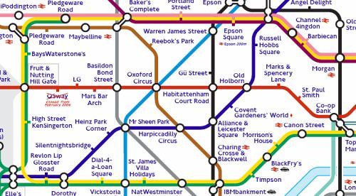
Fast forward to 1931, when Harry Beck, an engineering draftsman, created a revolutionary new map. Beck’s design was unlike anything that had come before it. Instead of adhering to the physical geography of London, he opted for an abstract, simplified layout. The Tube map was transformed into a network of straight lines and clear connections, with stations represented as uniformly spaced dots. This radical departure from realism allowed passengers to easily see the relationships between different lines and stations, making navigation a breeze.

The Impact of Beck’s Design

Harry Beck’s Tube map was a game-changer. It made the Underground accessible to the broader public, opening up London in ways that had never been imagined. Suddenly, navigating the sprawling city felt less daunting, and passengers could confidently hop on and off trains. The map not only facilitated travel but also ignited a love for urban exploration. People began to see London as an interconnected web of neighborhoods, each with its unique charm and attractions.

The Art of Color Coding

One of Beck’s genius innovations was the use of color coding for different lines. Each line was assigned a distinct hue, making it easy for travelers to quickly identify their route. This vibrant palette became synonymous with the Underground, allowing the map to be recognizable at a glance. Over the years, the colors have been refined, but the core concept remains the same. The visual impact of the colored lines made the map not just functional, but also aesthetically pleasing.

Keeping Up with Change

As London grew and the Underground expanded, adjustments to Beck’s design were necessary. New stations were added, lines were extended, and the network underwent significant changes. The map evolved alongside the city, adapting to the needs of its users. Each update was meticulously considered, balancing the need for clarity with the complexity of an ever-expanding network.

Design Philosophy: Simplicity Over Reality

What Beck introduced was more than just a map; it was a philosophy of design. The principle of simplicity over reality became foundational for many graphic designers. His approach demonstrated that clarity and ease of use should take precedence over accuracy. This idea is now embedded in many public transport systems worldwide, evidenced by the clean, minimalist designs that we see today.

Iconic Updates and Variations

Over the decades, the Tube map has undergone several notable updates. Designers have added elements, such as the iconic “tube” logo and the recognizable roundel symbol. They also experimented with new formats and designs, such as the “Bakerloo” and “Central” lines, which introduced fun typography and graphic elements. With each update, the design team aimed to preserve the essence of Beck’s original vision while ensuring the map remained useful and contemporary.

The Tube Map in Popular Culture

The Tube map’s influence extends far beyond the underground stations of London. It has infiltrated popular culture and has been referenced and parodied in various forms of media. From art installations to fashion, the distinctive style of the map has inspired countless creative projects. Artists like Eduardo Paolozzi and Ben Eine have reinterpreted the map in their work, showcasing its versatility as a design element.

The Tube Map Goes Digital

As technology advanced, so did the way we interact with the Tube map. The introduction of mobile apps revolutionized how commuters accessed the map. No longer constrained by a physical piece of paper, riders could now receive real-time updates and live journey planning at their fingertips. This digital transformation maintained the essence of Beck’s design while embracing the future of transportation.

Sustainability and Accessibility

In recent years, the focus on sustainability and accessibility has also influenced the design of the Tube map. The introduction of features like step-free access and the promotion of bike routes illustrate a shift toward an integrated transport system that accommodates all users. The map continues to evolve, reflecting changing societal values and the need for inclusivity in urban design.

The Tube Map: A Design Icon

Today, the Tube map is considered a masterpiece of graphic design, celebrated for its innovation and impact on urban navigation. It has been featured in exhibitions, received numerous awards, and is studied in design schools around the world. Beck’s original vision, which emphasized clarity and simplicity, has become a template for transport maps globally.

Conclusion: More than Just a Map

So, the next time you find yourself navigating the London Underground, take a moment to appreciate the artistry behind the Tube map. What was once a chaotic representation of a complex transport system has transformed into a design icon that is both functional and beautiful. Harry Beck’s genius lies not only in his groundbreaking design but also in his foresight to recognize that a map could be so much more than a tool for navigation. It could be a visual representation of a city’s spirit, an invitation to explore, and a source of pride for Londoners and visitors alike.

In the ever-evolving landscape of urban life, the Tube map stands as a testament to the power of thoughtful design. It has become an enduring symbol of London and continues to inspire generations of designers and city planners worldwide. Next time you glance at that familiar map, remember: you’re looking at history, innovation, and a piece of art that has shaped the way we think about urban transit. So grab your Oyster card, hop on the Tube, and get ready to explore the vibrant tapestry of London that lies just beyond the next station!

Posted on Leave a comment

The Most Beautiful Underground Stations in London You Shouldnt Skip

Discovering London’s Hidden Gems: The Most Beautiful Underground Stations

London, a city known for its rich history and vibrant culture, is also home to one of the most extensive and fascinating transportation networks in the world: the London Underground. While most travelers use the Tube as a means to get from point A to point B, many are unaware that beneath the bustling streets lie some architectural masterpieces that are worth a visit in their own right. In this guide, we will explore some of the most beautiful underground stations in London, ensuring that your next trip to the capital includes these hidden gems.

A Glimpse into History

Before we dive deep into our list, let’s take a moment to appreciate the history behind the underground system. The London Underground, affectionately known as “the Tube,” opened in 1863, making it the first underground railway in the world. Over the years, many stations have undergone renovations, while others have been preserved as historical landmarks. This mixture of old charm and modern design creates a unique atmosphere that can transport you back in time while still reminding you of the city’s contemporary spirit.

1. St. Pancras International

St. Pancras International is more than just a Tube station; it’s a masterpiece of Victorian Gothic architecture. The stunning red-brick building features soaring arches, intricate details, and the iconic clock tower. The station is also home to the Eurostar service, connecting London to mainland Europe. Even if you’re not catching a train, the station’s grand interior, complete with shops and restaurants, makes it a perfect spot for a leisurely stroll. Don’t forget to take a moment to admire the famous statue of the “Meeting Place” couple, which adds a romantic touch to the bustling environment.

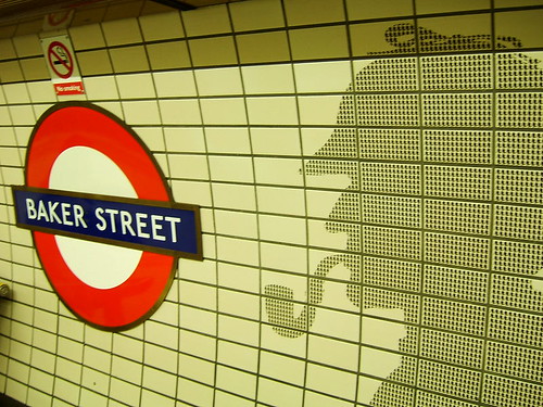
2. Baker Street

Baker Street, home to the world-renowned fictional detective Sherlock Holmes, is another station that captures the essence of London’s charm. The station is adorned with beautiful tiled murals and features an exhibition dedicated to Holmes and his creator, Sir Arthur Conan Doyle. The distinctive red and white tiling on the walls, alongside the grand central hall, gives the station a unique character. Plus, you can enjoy a bit of London’s literary history while you’re there, making it an essential stop on your underground adventure.

3. South Kensington

If you’re a fan of museums, South Kensington will be a delight. This station serves as the gateway to some of the city’s most famous attractions, including the Natural History Museum and the Victoria and Albert Museum. The station itself boasts beautiful tile work and an elegant, spacious layout. The unique combination of art and education makes it an enriching experience for any visitor. Take a moment to look around and appreciate the intricate designs that adorn the walls while you’re on your way to explore the cultural treasures nearby.

4. Notting Hill Gate

Famous for its colorful row houses and vibrant market, Notting Hill Gate station is a visual treat. The station features bright, cheerful tiles that reflect the lively atmosphere of the surrounding neighborhood. The standout feature here is the stunning mosaics that depict various aspects of the Notting Hill area, including the famous Portobello Road Market. As you descend into the station, you’ll be greeted by a vibrant and welcoming ambiance that sets the tone for your exploration of this iconic London district.

5. Green Park

Nestled right in the heart of the city, Green Park station is an oasis of tranquility amid the hustle and bustle. The station’s understated elegance is characterized by its simple yet stylish design, featuring a beautiful white-tiled archway that leads to the platform. The absence of advertising and the serene atmosphere make it a refreshing stop. Moreover, its proximity to Buckingham Palace and the lush Green Park itself offers travelers the chance to enjoy a peaceful stroll after their underground journey.

6. Covent Garden

Covent Garden station is a feast for the eyes and ears. The station is known for its elegant Victorian architecture and vibrant atmosphere, reflecting the lively market that lies above. The distinctive tiled walls and intricate designs around the platforms create a charming aesthetic. Additionally, Covent Garden is famous for its street performers, shops, and cafes, making it a perfect stop for those looking to soak in the local culture. Be sure to take a moment to enjoy the performers before heading back underground.

7. Liverpool Street

Liverpool Street station is a striking blend of old and new. Housed in a beautifully restored Victorian building, the station features glass and steel structures that complement its historical elements. The grand concourse area is filled with light and bustling with commuters, but it’s the intricate mosaics and attention to detail that truly captivate. The station serves as a major hub for London’s business district, but it’s also a gateway to the trendy areas of Shoreditch and Spitalfields, making it a perfect starting point for your urban adventure.

8. Westminster

No trip to London would be complete without a visit to Westminster station. With its stunning Art Deco design, this station is an architectural gem that often gets overlooked. The original 1990s tiling remains intact, and the yellow and black color scheme gives it a distinctive look. The station’s proximity to several iconic landmarks, including the Houses of Parliament and Big Ben, means that it’s not just a beautiful station but also a convenient one. Take some time to linger and appreciate the design before heading out to explore the nearby attractions.

9. Bank

Bank station is one of the most complex and historic stations in the London Underground network. The station serves as a gateway to the City of London, but it’s also known for its stunning architecture. The ornate details throughout the station, combined with its impressive underground tunnels, create a sense of grandeur. The beautiful mosaics and classical elements reflect the station’s rich history, making it an interesting place to explore. Plus, you can find yourself amidst the financial heart of the city, surrounded by some of London’s most iconic buildings.

10. Leicester Square

Last but certainly not least, Leicester Square station is a vibrant hub of activity, reflecting the energy of the West End theater district. The station’s art deco style features brightly colored tiles and a lively atmosphere that welcomes visitors. It’s also an excellent starting point for those looking to catch a show or enjoy a night out in the area. The vibrant nightlife, combined with the station’s aesthetic charm, makes it a must-see stop on your underground journey.

Conclusion: Journey Beyond the Surface

While the London Underground is often seen merely as a mode of transport, it is also a testament to the city’s rich architectural heritage. Each of these stations tells a story and contributes to the cultural fabric of London. So, the next time you find yourself navigating the Tube, take a moment to step away from the hustle and bustle of your travels. Explore, appreciate, and enjoy the beauty of these underground gems that lie beneath the surface of one of the world’s most captivating cities. Happy travels!

Posted on Leave a comment

The History of the Mug: From Drinking Vessel to Insult

white ceramic mug on white surface

Introduction

The term “mug” has a fascinating journey through history. What began as a simple drinking vessel has morphed into a term used in various contexts, including an amusing and somewhat cheeky insult. This article will take you on a delightful ride through time, exploring the evolution of the word “mug” from its origins to its contemporary usage in both the physical and metaphorical senses.

Origins of the Mug

The word “mug” can be traced back to the 15th century, derived from the Middle English term “mugge” or “mugg,” which referred to a large cup used for drinking. The earliest mugs were typically made from wood, clay, or metal, often featuring a handle for convenience. They served a practical purpose: to hold beverages ranging from water and ale to coffee and tea.

As time marched on, mugs began to evolve in design and materials. By the 16th century, potters were producing earthenware mugs adorned with intricate designs. The invention of porcelain in China and its later introduction to Europe in the 18th century led to a significant transformation. Porcelain mugs became symbols of status and sophistication, often decorated with elaborate artwork that reflected the owner’s taste and wealth.

Mugs Through the Ages

The Renaissance and Beyond

During the Renaissance, the mug continued to be a popular drinking vessel, especially in taverns and homes. It was during this period that the classic tankard design emerged, featuring a hinged lid to keep beverages fresh and safe from contamination. These tankards were often made of pewter, silver, or glass, and were often inscribed with the owner’s name or family crest.

In the 19th century, the Industrial Revolution brought about mass production, leading to an explosion of mug designs and styles. From simple creamware to intricately designed transferware, there was a mug for every taste and occasion. The introduction of coffee and tea into everyday life further solidified the mug’s place in society. Suddenly, everyone wanted a stylish cup to enjoy their afternoon brew!

The Mug as an Insult

Fast forward to the 20th century, and we see an interesting shift in the term “mug.” In British slang, “mug” became a playful yet cutting term for someone who is easily fooled or taken advantage of. This usage likely stems from the notion that a mug, being a simple object that holds liquid, can be seen as a symbol of someone who is passive or gullible.

The transition from drinking vessel to insult is not entirely baffling. The playful nature of language allows for such transformations, and in this case, the mug’s everyday familiarity made it a prime candidate for playful derision. Imagine calling someone a “mug” in a cheeky banter; it adds a certain flair to the conversation while still delivering a sting.

Mugshots and the Criminal Connection

Another fascinating aspect of the word’s evolution is its connection to law enforcement. The term “mugshot” emerged in the late 19th century, referring to photographs taken of criminals upon their arrest. The origin of this term might be linked to the notion of a “mug,” as both a physical face and an object that can be displayed or presented to the public.

Mugshots became an essential part of police records, helping identify repeat offenders and contributing to the growing field of criminology. Today, the term is widely recognized, and mugshot databases have even emerged online, showcasing the faces of numerous unfortunate souls.

The Cultural Impact of Mugs

Mugs have also made their mark in popular culture, appearing in literature, films, and television shows. They often symbolize comfort, relaxation, and conviviality. Think about it: when you see a character curled up with a steaming mug of coffee or tea, it evokes a sense of warmth and familiarity.

In contemporary society, mugs have become a canvas for self-expression. Custom mugs with witty sayings, personalized names, or creative designs flood the market. They make perfect gifts and serve as conversation starters. Whether it’s a funny quip, a motivational quote, or a tribute to a beloved hobby, mugs have become an integral part of our daily lives.

The Mug in Modern Language

As language continues to evolve, so does the usage of “mug.” It can be used in a variety of contexts, from light-hearted banter among friends to serious discussions about being taken advantage of. Some might refer to someone as a “mug” in jest, while others might use it more seriously to indicate a lack of common sense.

Moreover, the term has been embraced by pop culture, especially in music and comedy. Various artists and comedians have used “mug” in their work, giving it a humorous spin that resonates with audiences. The term embodies a certain cheekiness that many find endearing, and it adds a layer of relatability to everyday conversations.

Mugs in Different Cultures

Across the globe, different cultures have their unique takes on the humble mug. In Japan, for instance, traditional tea mugs called “yunomi” are crafted without handles and are designed for sipping tea in a mindful manner. In contrast, in Germany, beer steins—often referred to as mugs—feature intricate designs and are a staple during Oktoberfest celebrations.

These cultural variations highlight the mug’s versatility as both a functional object and a symbol of social connection. Whether in a bustling café in Paris or a local pub in Dublin, mugs bring people together over shared experiences, making them an enduring part of human culture.

Conclusion

The journey of the mug from a practical drinking vessel to a cheeky insult and beyond is a testament to the fluid nature of language and culture. It serves as a reminder that even the simplest objects can have rich histories and fascinating stories. So the next time you lift a mug to your lips—whether it’s filled with coffee, tea, or something stronger—take a moment to appreciate its journey through time and the myriad meanings it has come to embody. After all, it’s more than just a vessel; it’s a piece of history, culture, and even a bit of mischief!