Introduction to the Tube Map Phenomenon
The London Underground, affectionately known as the Tube, is not just a mode of transportation; it’s a symbol of the city itself. From tourists snapping selfies at iconic stations to locals weaving through the maze of lines during rush hour, the Tube is integral to the rhythm of London life. But if you take a closer look at the Tube map, you might notice something peculiar: it doesn’t reflect the actual geography of London. Instead, it’s a carefully crafted representation that has become a design marvel in its own right. Let’s dive into how this map distorts geography and why this approach has ultimately been a resounding success.
A Brief History of the Tube Map
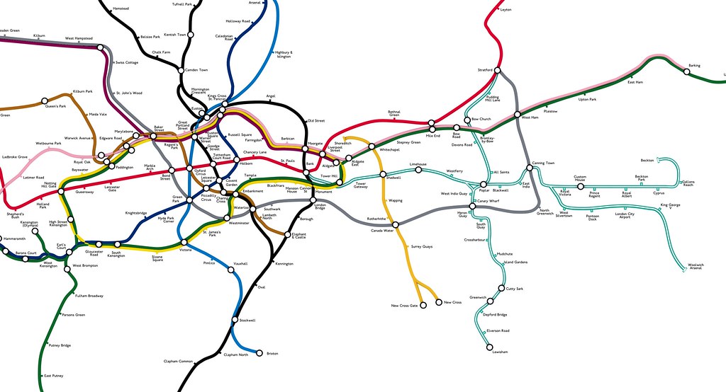
The inception of the Tube map dates back to the early 20th century. In 1931, Harry Beck, an engineering draftsman, designed the map that we recognize today. He sought a way to simplify the complex web of underground lines, opting for a non-geographical representation. By using a grid layout and straight lines, Beck created a map that was easy to read, even for those unfamiliar with the city. This revolutionary approach transformed the way commuters navigated the Tube, shifting the focus from geography to accessibility.
The Map’s Distortions Explained
While Beck’s map is undoubtedly iconic, it intentionally distorts distances and angles. For instance, the stations might appear closer together than they are in reality, and the geography of the city is sacrificed for clarity. Here are some notable examples of how this distortion plays out:
Distance Between Stations
One of the most glaring examples of distortion is the distance between stations. For instance, the bustling areas of Camden and Leicester Square are depicted as being a short hop away from each other, but in reality, they are a considerable distance apart. This is a common occurrence throughout the map, where some stations are clustered together while others are spaced out, all for the sake of clarity.
Misrepresentation of Geography
London is a sprawling city with a diverse geography, including parks, rivers, and varied neighborhoods. The Tube map flattens this complexity into a simple, abstract representation. The River Thames, which runs through the heart of London, is represented as a straight line, and the beautiful parks like Hyde Park and Regent’s Park are merely dots on the map. This abstraction strips away the richness of London’s landscape but aids in the map’s usability.
Why It Works: The Power of Abstraction
Despite its geographical inaccuracies, the Tube map works brilliantly for several reasons:
Simplification for Navigation
The primary purpose of the Tube map is to help passengers navigate the Underground system quickly and efficiently. By using straight lines and a consistent design, passengers can easily determine how to get from Point A to Point B without being bogged down by the complexities of the city’s actual layout. This level of simplification allows for quick decision-making, which is essential during the bustling rush hours.
Increased Inclusivity
The Tube map is designed to be accessible to everyone, including tourists who may not be familiar with London’s geography. This abstraction makes the map universally understandable, regardless of a passenger’s prior knowledge of the city. People from different backgrounds can use the map with confidence, making it an inclusive tool for navigation.
The Influence on Other Cities
The success of the Tube map has influenced the design of transit maps worldwide. Cities like Paris, New York, and Tokyo have adopted similar strategies, opting for simplified, non-geographical maps that prioritize clarity over accuracy. This global trend reflects an understanding that usability is often more critical than geographic precision when it comes to public transportation.
Iconic Branding and Cultural Impact
The Tube map has transcended its original purpose as a navigation tool to become a cultural icon. It has inspired art, fashion, and even music. Its distinct design and vibrant colors make it instantly recognizable, and it’s often used in various forms of media to symbolize London.
Art and Design
Artists have reimagined the Tube map in countless ways, from minimalist designs to elaborate reinterpretations that highlight various aspects of London’s culture and history. These artistic ventures demonstrate the map’s versatility and its ability to resonate with people on multiple levels.
Fashion Statements
The map has also made its way into fashion. Clothing brands have incorporated the Tube map into their designs, creating trendy apparel that celebrates London’s iconic transport system. From T-shirts to tote bags, the Tube map serves as a fashionable reminder of the city’s rich urban tapestry.
The Future of the Tube Map
As technology continues to evolve, so too does the way we navigate our environments. Mobile apps and GPS systems have changed the way people interact with maps, providing real-time updates and geographical accuracy. However, the Tube map remains relevant, proving that traditional designs can coexist with modern technologies.
Digital Adaptations
The London Underground has embraced technology by developing digital versions of the Tube map. These digital maps often feature additional information, such as live service updates and accessibility options. This integration of technology allows commuters to benefit from both the clarity of the traditional map and the advantages of modern navigation tools.
Conclusion: A Love Letter to the Tube Map
In the end, the London Tube map is a testament to the power of design. Its distortions may misrepresent the geography of London, but they serve a greater purpose: to simplify navigation and make the city accessible to everyone. It’s a brilliant example of how function and form can come together to create something extraordinary.
Whether you’re a daily commuter or a tourist exploring the vibrant streets of London, the Tube map remains an essential companion, guiding you through the city’s underground labyrinth with ease. So, the next time you find yourself riding the Tube, take a moment to appreciate the artistry and ingenuity behind the map. After all, it’s not just about where you are; it’s about where you’re going—and this map is here to help you get there.